
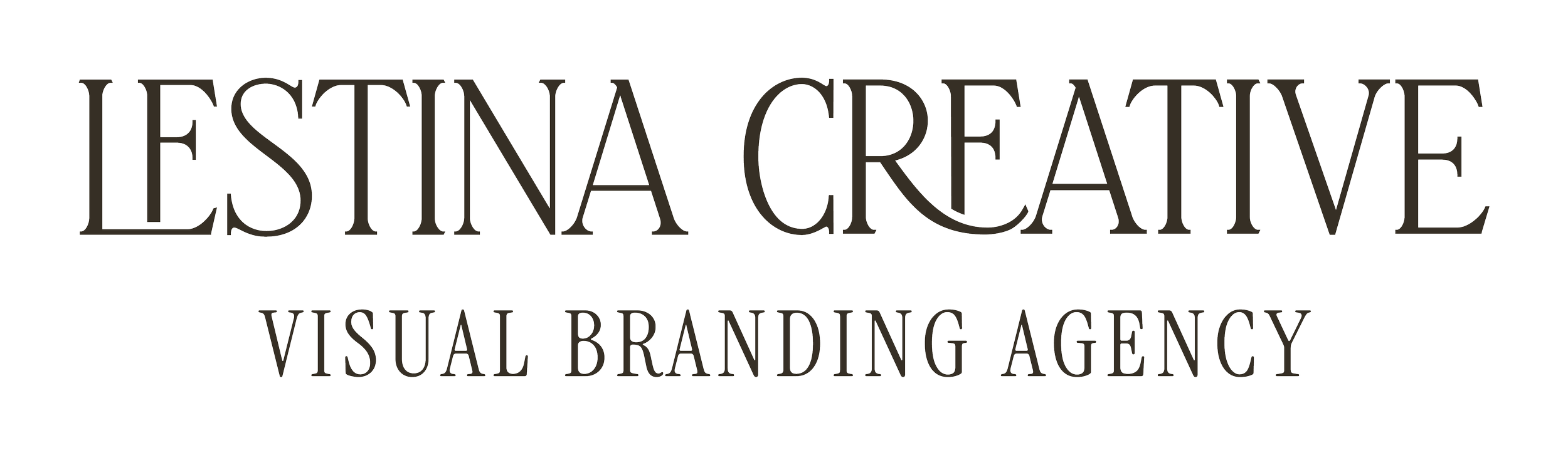
VISUAL BRANDING AGENCY
LESTINA CREATIVE
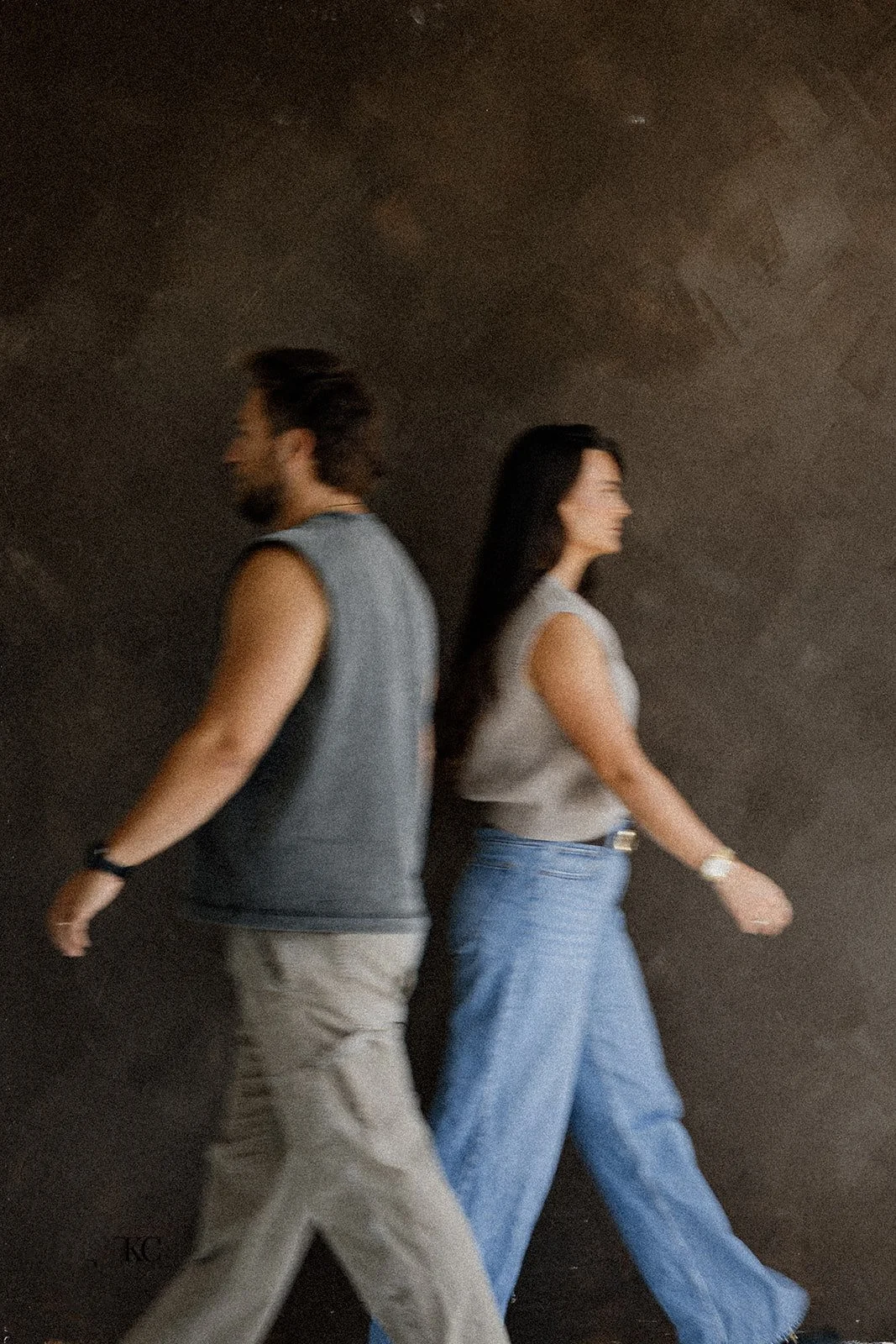
Lestina Creative is an Arizona-based visual branding agency, specializing in brand photography and videography. Karlie and Jacob, co-founders and husband-and-wife-duo, plan to expand their services in the near future and wanted a brand identity system that appealed to their target audience (other luxury service providers) and that complemented their sister company’s brand identity.
ROLE
Creative Direction
Identity System
Graphic Design
Brand Photography


Approach
PHASE 01: BRAND FOUNDATIONS EXPLORATION
Using our Brand Foundations Questionnaire as a starting point, we gathered key information on Lestina Creative: their background, goals for their business, target audience demographics, and more. Co-founder Karlie found this step to be “one of the most valuable pieces to working on our brand identity.”
PHASE 02: RESEARCH
Using the information from phase one, we researched four of Lestina Creative’s main competitors in their market: businesses that aligned with their target audience, service offerings, etc. We analyzed their online presence, strengths and weaknesses, and presented some key takeaways on how we can use Lestina Creative’s brand identity and implementation to elevate them above these key competitors.
PHASE 03: MOODBOARD
Using textures, colors, fonts, imagery, and other sources of inspiration collaboratively gathered alongside the Lestinas, we built a moodboard that showed the direction we felt strongest represented the strategic approach and personality we wanted the brand to embody.
PHASE 04: ITERATE
We spent a significant chunk of time exploring family crests, meanings behind symbols, sketching, re-sketching, and building out concepts digitally until we got to a direction that we felt embodied the spirit of Lestina Creative.
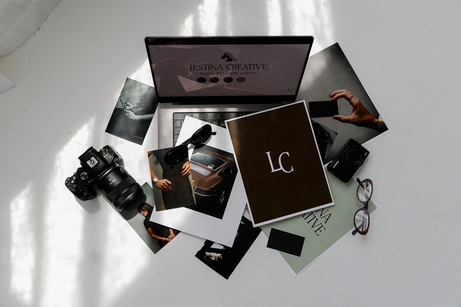
PHASE 05: CREATE VISUAL SUITE
We built out a robust suite of logos for different spaces, scenarios, and applications, along with a custom typeface palette and a color palette that felt cohesive with their sister company’s branding.
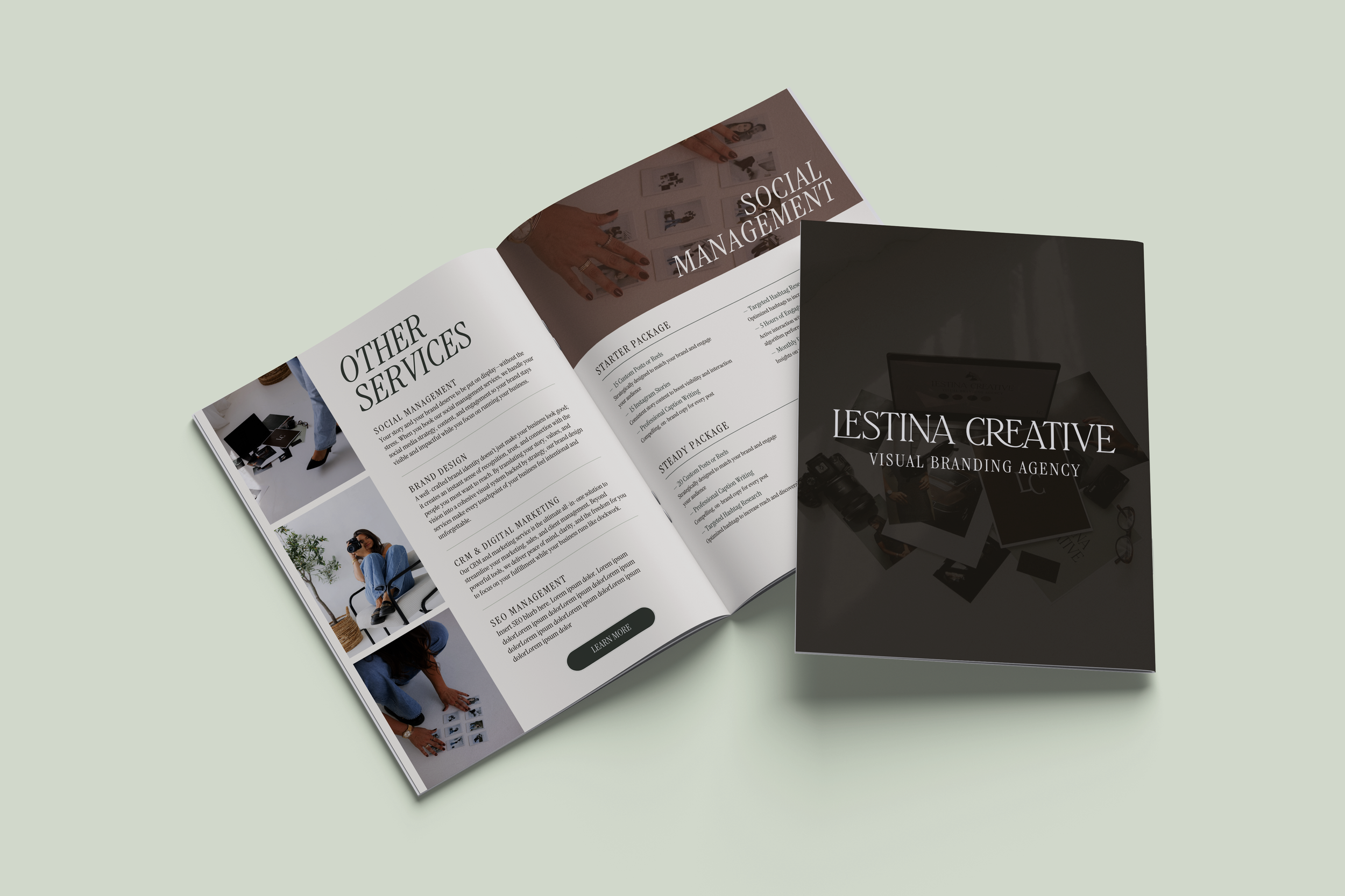
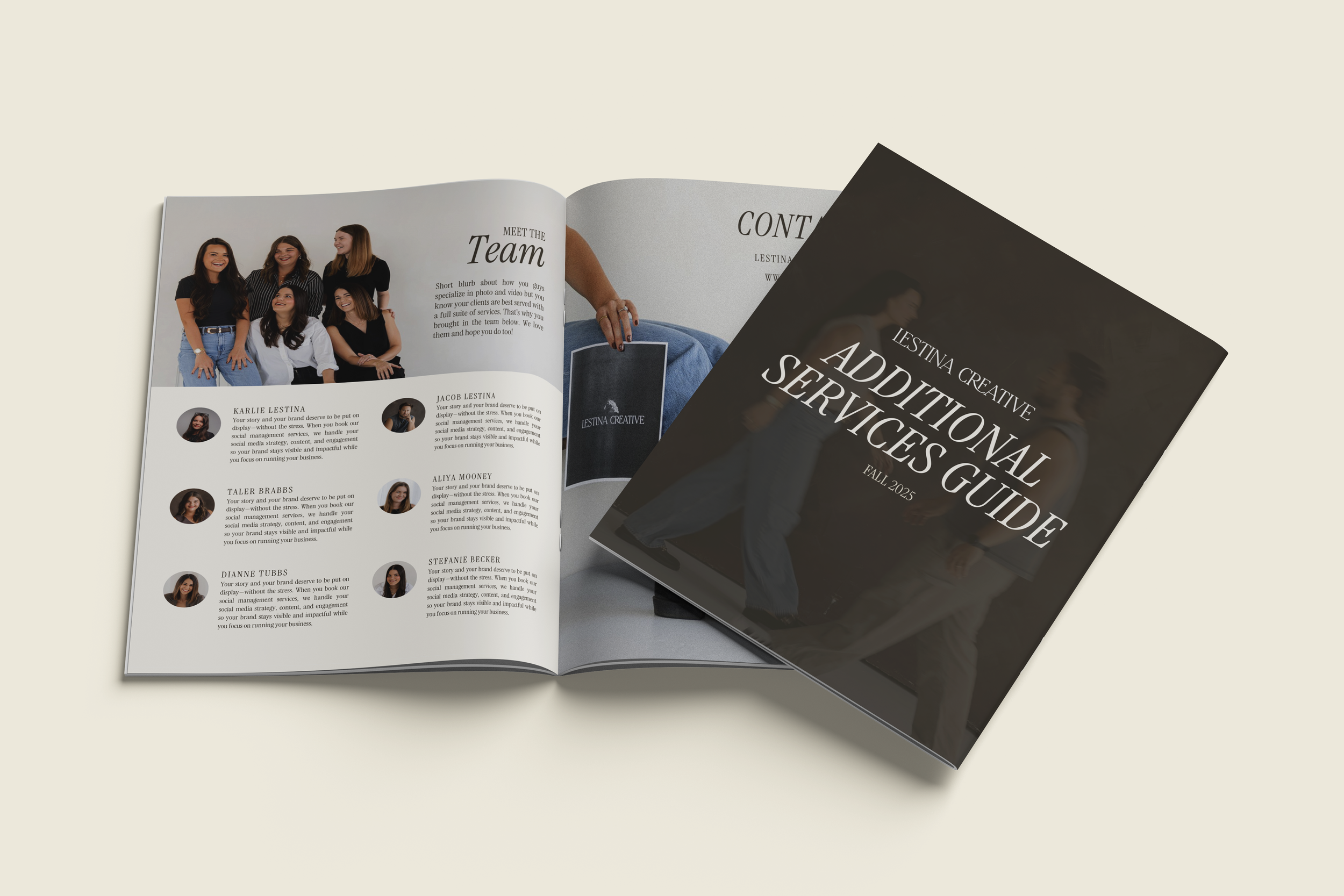
PHASE 06: APPLICATIONS
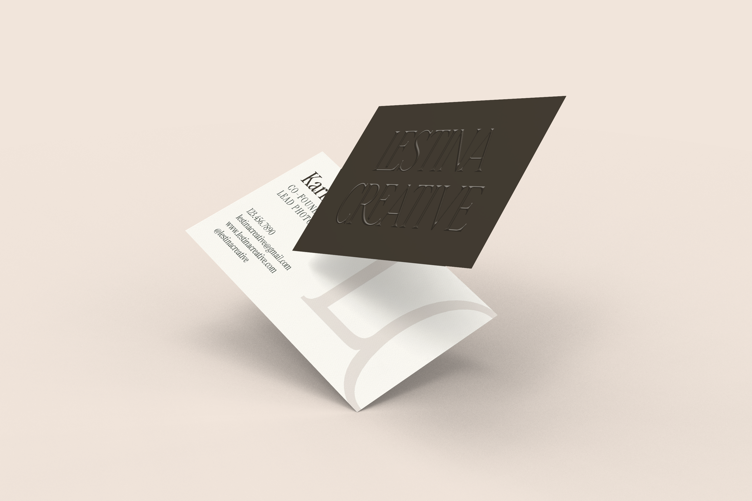
Lestina Creative requested a customized business card design as a part of this project. We applied their branding to this application, as well as a few different hypothetical uses so they could see how their branding looked when in action.
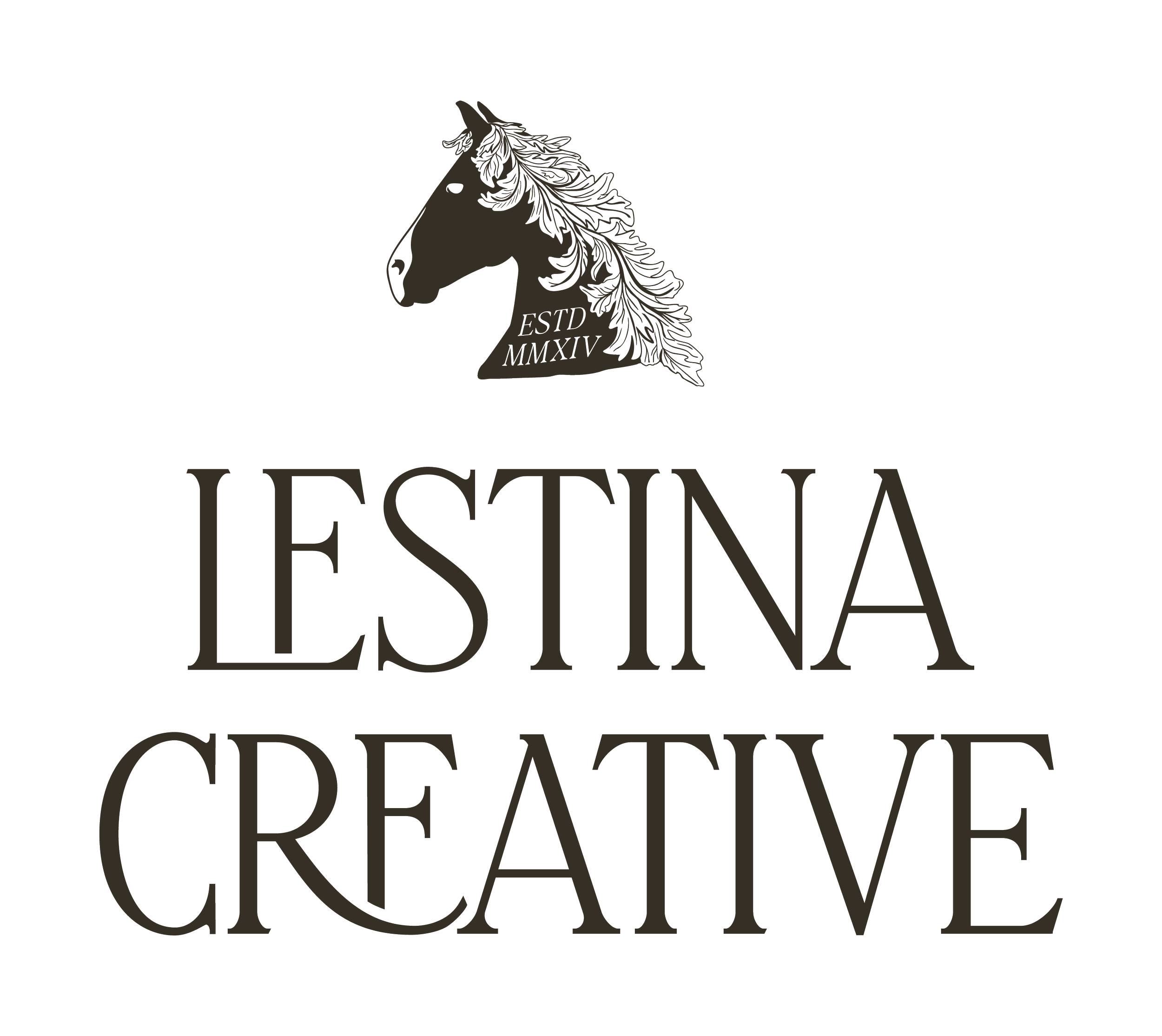
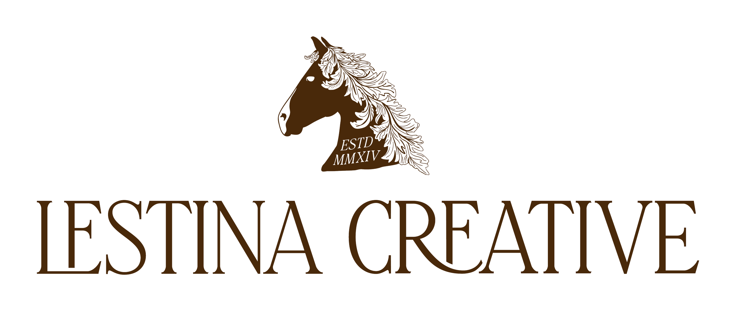
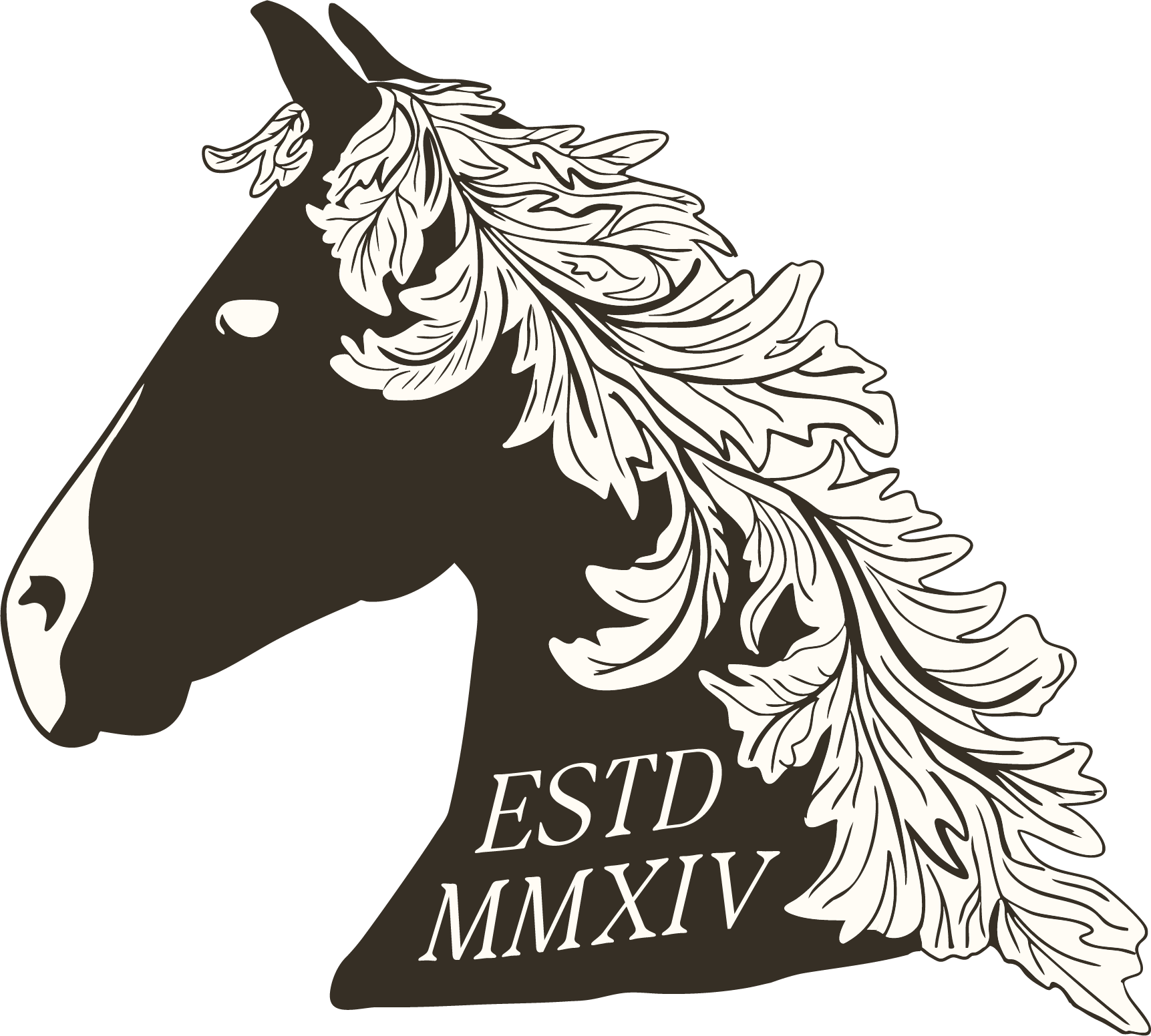
PRIMARY LOGO
Lestina Creative wanted to blend the feeling of East Coast “old money” with the approachability of West Coast family values and culture. To achieve this, we spent a lot of time researching symbolism and landed on the representation of a steed with an oak leaf-like mane. In ancient times, a steed represented one’s preparedness for battle, and the oak tree one’s deep wisdom and virtue.
This symbol also subtly honors the Lestina family’s personal ranching background, while also representing both the culural icon of an equestrian horse (common in East Coast/European culture) and West Coast cattle ranching.
SUPPORTING ASSETS
Lestina Creative needed a few logo variations to utilize throughout their platforms. We provided them with two primaries (one with the horse, one without) and two secondaries, along with a tertiary that specified their industry. We also provided them with a brand mark and a standalone version of the steed illustration utilized in their other brand marks.


CUSTOMIZED COLOR AND TYPEFACE PALETTE

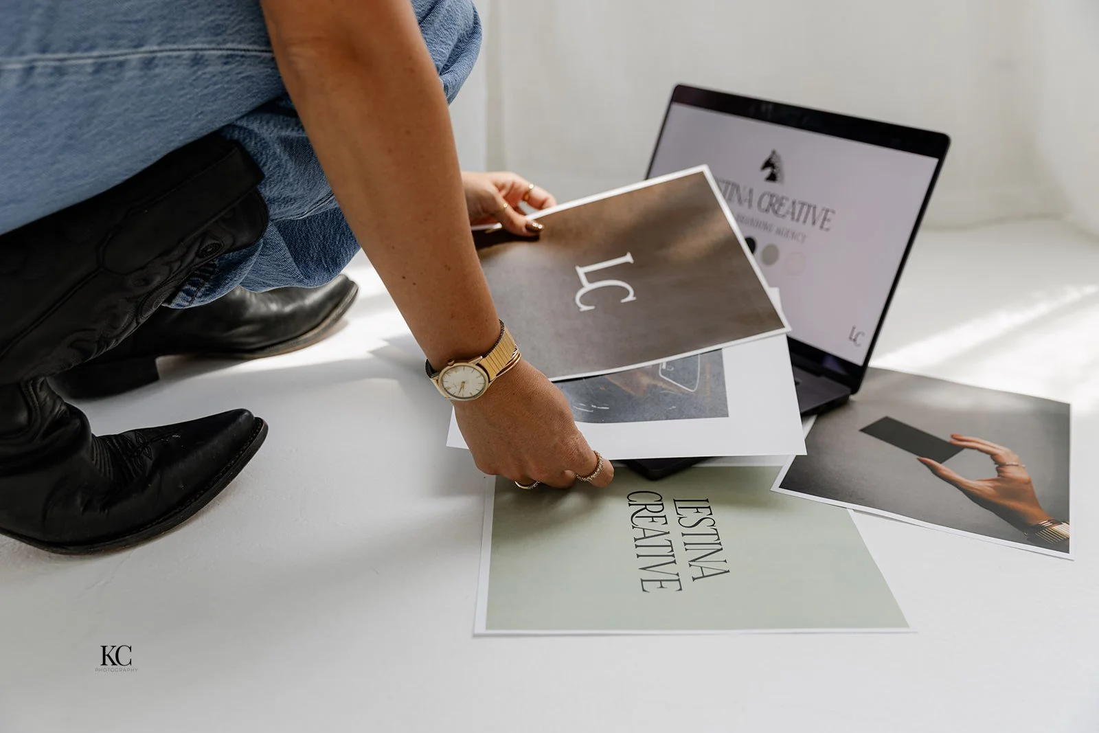
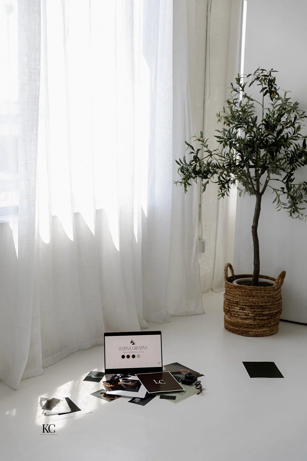
BRAND PHOTOGRAPHY
Shoot art directed by Karlie Lestina. Shot by Hearthstone Creative, edited by Karlie Lestina.


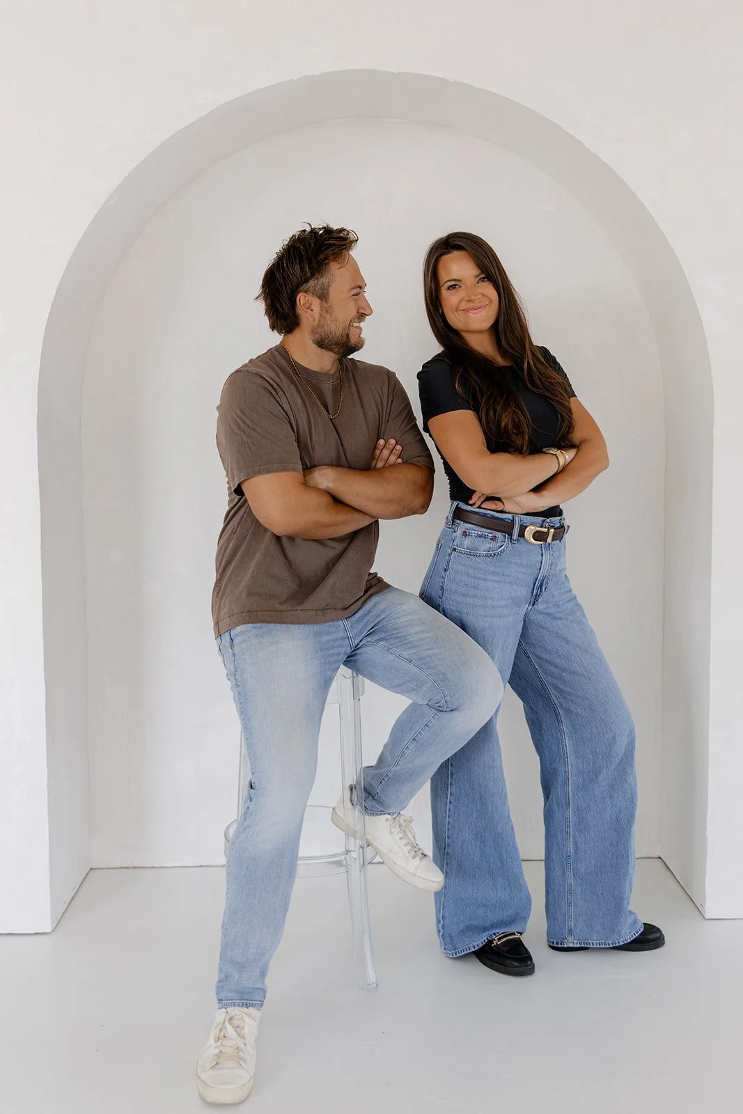
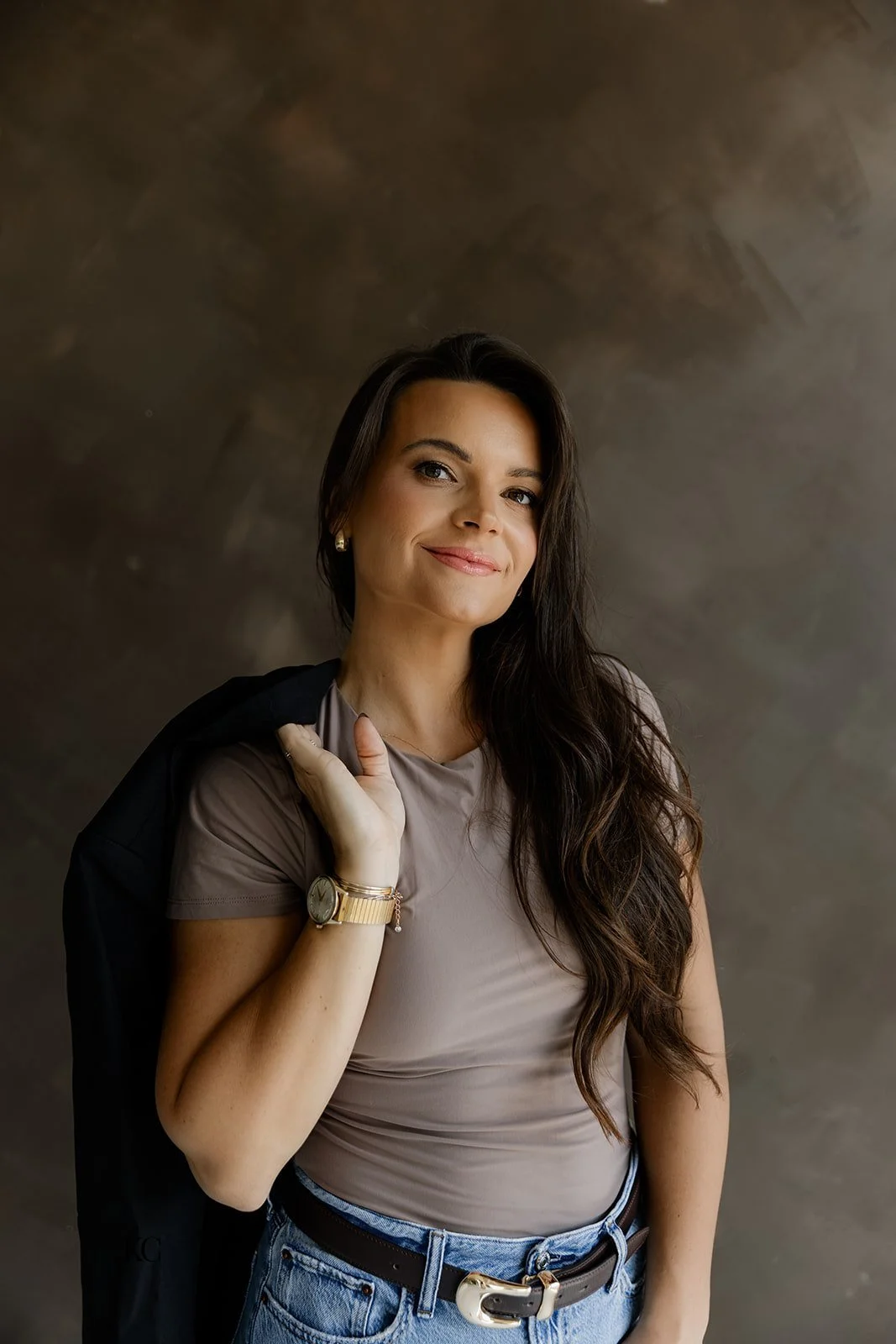


Karlie, Co-Founder and Lead Photographer
“Working with Hearthstone we were very impressed by the exceptional communication. Aliya is very professional yet relatable, and she has a true deep care for our personal brand.”