COFFEE ROASTERS
CLEAVE COFFEE CO.
Cleave Coffee Co. is a PNW-based coffee roasting business. The founders wanted a fresh, professional yet warm brand for their new coffee roasting business. Together, we developed a brand identity, logo suite, color and typeface palette, along with a branded evergreen packaging solution.
ROLE
Creative Direction
Identity System
Packaging
Graphic Design
Packaging images courtesy of Peak Visuals.

Approach
PHASE 01: BRAND FOUNDATIONS EXPLORATION
Using our Brand Foundations Questionnaire as a starting point, we gathered key information on the goals, current market competitors, and the brand persona Emily and Andrew wanted Cleave to take on.
PHASE 02: RESEARCH
Using the information from phase one, we spent a chunk of time looking into Cleave’s existing competitors in the PNW coffee industry. We paid extra close attention to packaging, social media presence, and websites. Using this information, we put together a presentation outlining each competitor’s strengths, weaknesses, and ideas of how Cleave could use these to their advantage.
PHASE 03: MOODBOARD
Using textures, colors, fonts, imagery, and other sources of inspiration collaboratively gathered alongside the founders, we built two moodboard concepts for Emily and Andrew to review.
PHASE 04: CRAFT BRAND CONCEPTS
We started with the brand identity and created two concepts for the founders to review. Once this step was done, we refined minor details, and prepared the colors, fonts, and logos to apply to packaging.
PHASE 05: PACKAGING DESIGN
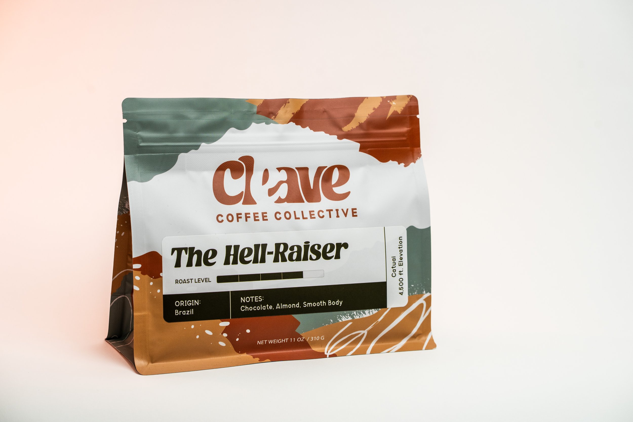
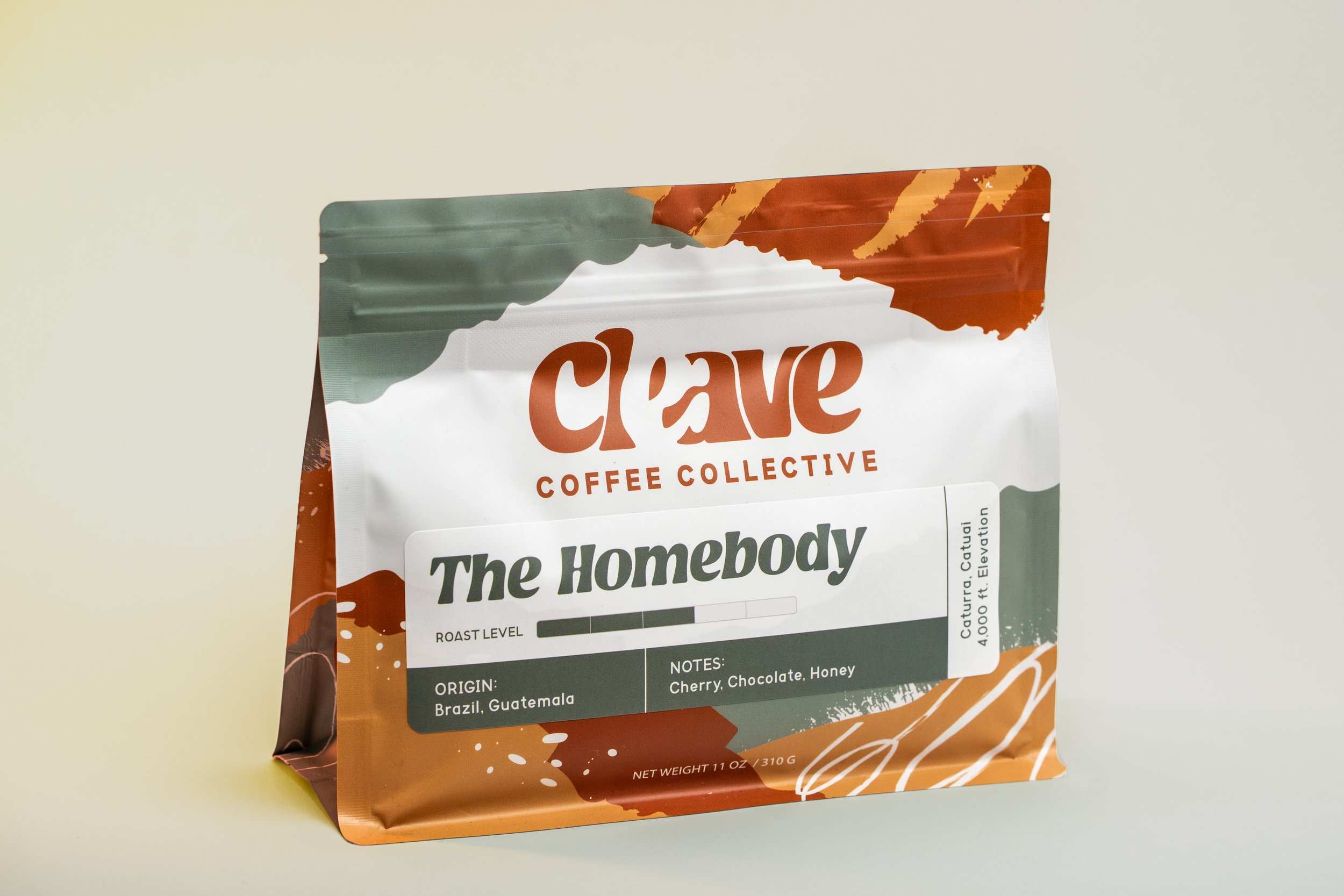
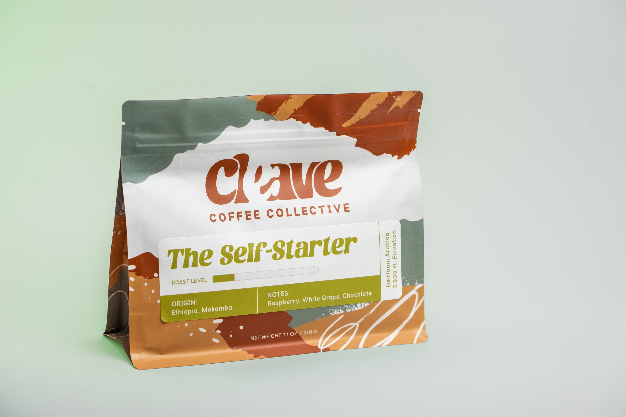
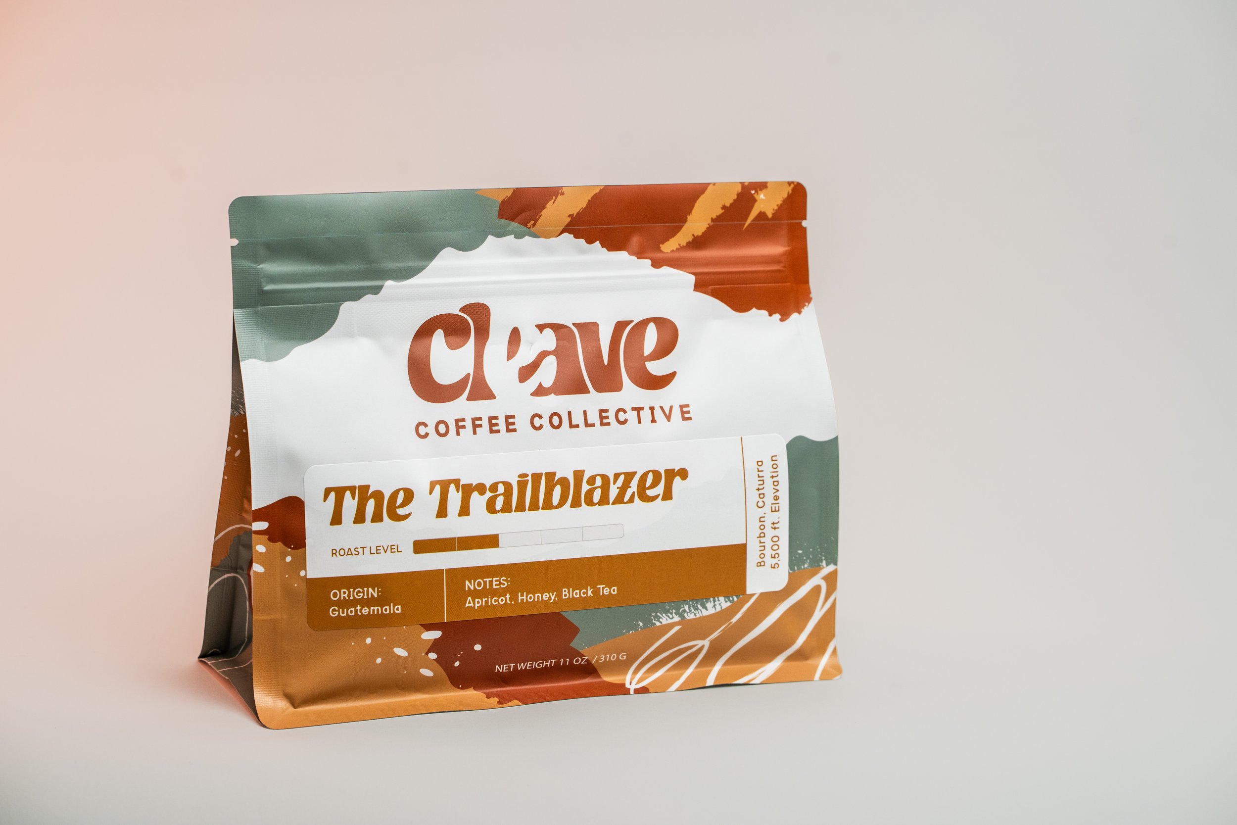
Emily and Andrew needed a package system that would be distinct from others in their industry but still versatile (and cost-effective) enough that they could use the same bag for different coffee blends. We decided on a main bag design with bold colors and patterns, and a sticker design that could be customized to the blend.
PHASE 06: BRAND APPLICATION
We applied the branding from phase four to the package design concept in phase five. The final design included a main bag and four custom sticker designs.

PRIMARY LOGO
Cleave wanted an approachable and warm brand that felt distinct. A big part of their brand mission is to enable its consumers to have moments of connection and hospitality over a good cup of coffee. They also longed to bridge the gap between coffee bean farmers and the consumers, with an overarching understanding that every piece of the coffee process is valuable.
This led to the key concept: “Everyone plays a piece in the puzzle.” To communicate this, we used intentionally-placed negative space within a rounded, youthful typeface , evoking a sense of a “missing piece.” A fun bonus detail, “e” and “a” are the first initials of the co-founders.
SUPPORTING ASSETS
We created a few logo variations for Cleave to utilize in different spaces.
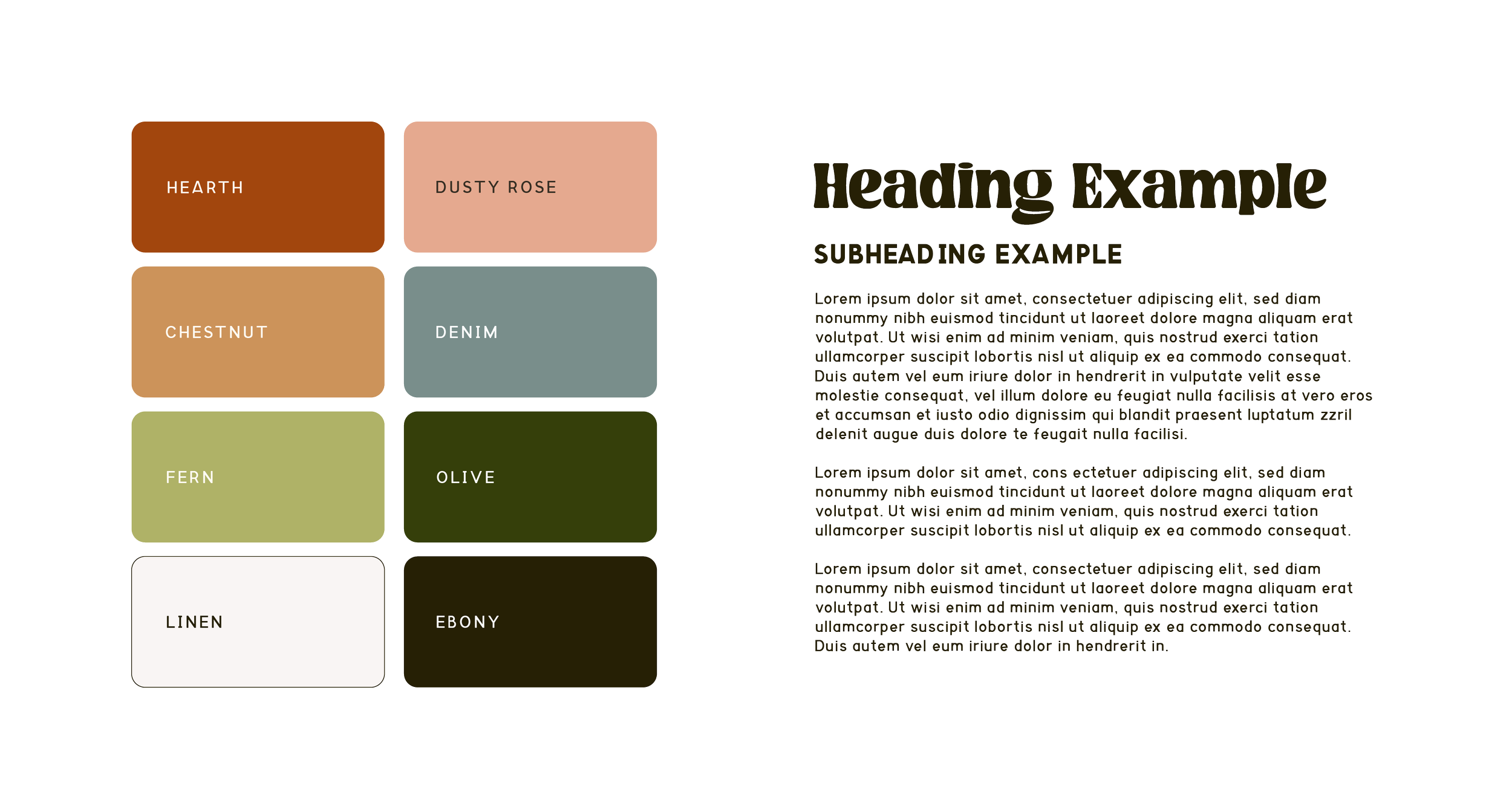
CUSTOMIZED COLOR AND TYPEFACE PALETTE
Emily Botterbusch, Co-Founder
“We love Aliya at Hearthstone! She was incredibly professional, so patient with us as we developed our brand identity and the things she created fit both of our personalities so well. We will be reaching back out soon!”