


WEDDING PHOTO + VIDEO DUO
SIERRA + AUSTIN MEDIA
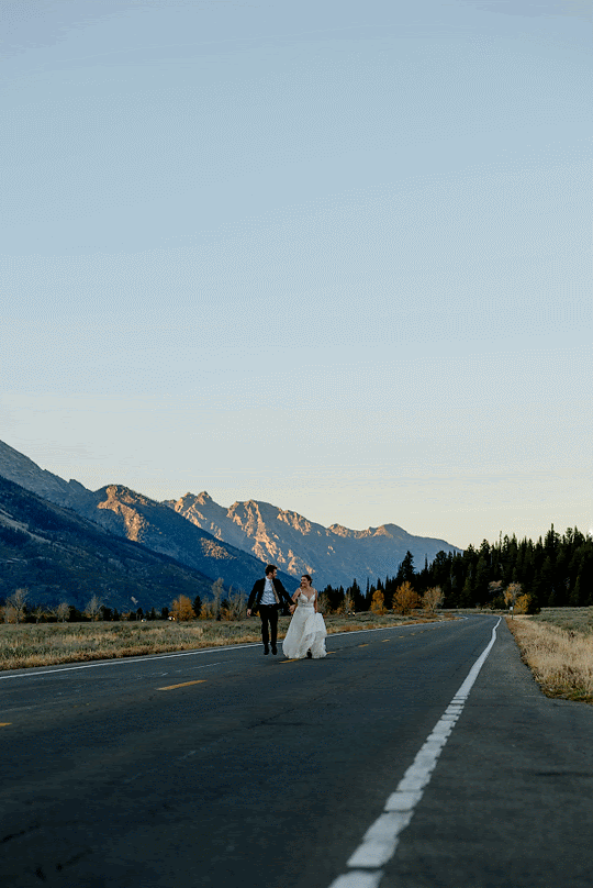
Sierra & Austin Media is a Boise-based photo + video duo that are all about bringing the party, the energy, and the joy to their clients’ wedding day. They specialize in working with down-to-earth, fun-loving clients and wanted their brand to represent their vibe: a duo that shows up like friends and delivers like pros.
ROLE
Creative Direction
Brand Strategy
Identity System
Graphic Design
Images courtesy of Sierra & Austin Media
Approach
PHASE 01: BRAND FOUNDATIONS EXPLORATION
Using our Brand Foundations Questionnaire as a starting point, we gathered key information on Sierra & Austin Media: their background, goals for their business, target audience demographics, and more.
PHASE 02: RESEARCH
Using the information from phase one, we researched three of SAM’s main competitors in their market: businesses that aligned with their target audience, service offerings, etc. We analyzed their online presence, strengths and weaknesses, and presented some key takeaways on how we can use SAM’s brand identity and implementation to elevate them above these key competitors.
PHASE 03: MOOD BOARDS
Using textures, colors, fonts, imagery, and other sources of inspiration collaboratively gathered alongside Sierra & Austin, we built two mood board directions that showed different approaches we could take. They picked the one they felt was strongest and we got to creating.
PHASE 04: ITERATE
We spent a significant chunk of time sketching monograms, exploring unique typefaces and building out concepts digitally until we got to a direction that we felt embodied the spirit of SAM.
PHASE 05: CREATE VISUAL SUITE
We built out a robust suite of logos for different spaces, scenarios, and applications, along with a custom typeface palette, color palette, and brand pattern that felt true to who Sierra & Austin are as people, and that attracted the types of couples they want to be working with.
PHASE 06: APPLICATIONS
We applied their branding to a few different hypothetical uses so they could see how their branding looked when in action.

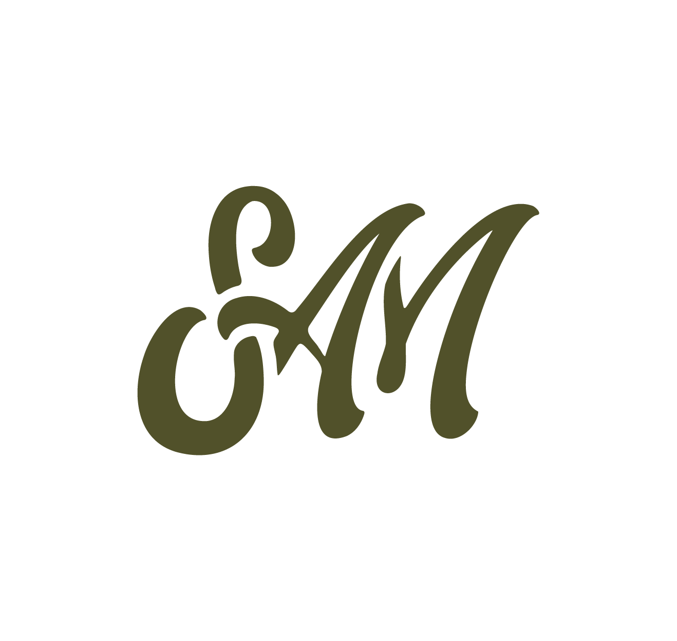
PRIMARY LOGO
Sierra + Austin wanted their brand to feel full of energy and joy, with a touch of outdoor influence. Using inspiration from classic outdoor brands, we designed a logo using a typeface full of funky curves, custom ligatures, and rounded edges to achieve these goals.
The result? A mark that communicates connection, warmth, and joy. We purposefully connected the two names to show that Sierra & Austin work as a fluid team, ebbing and flowing creatively on shoot day to create a seamless experience for their clients.
SUPPORTING ASSETS
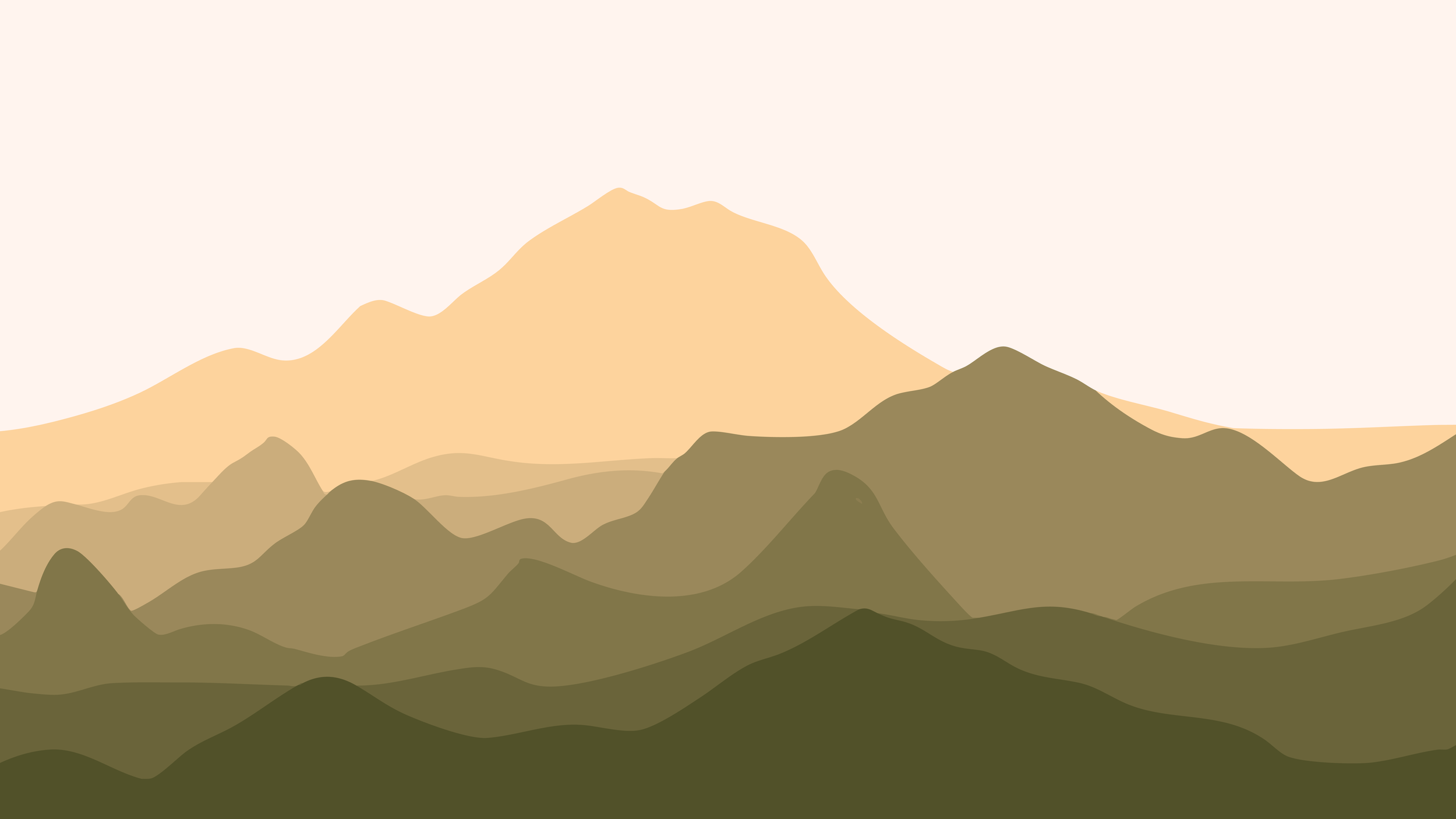
Sierra & Austin requested a primary and secondary logo to use in various spaces throughout their marketing channels. We also provided them with a brand mark and a custom brand pattern, inspired by the mountains of where their business was formed.

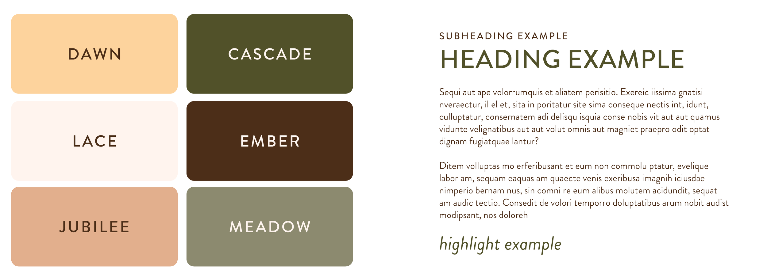
CUSTOMIZED COLOR AND TYPEFACE PALETTE

Sierra, Founder + Photographer
“No part of the process felt like work. instead it felt like chatting with a bestie who turned around and made a beautiful professional brand that felt exactly like my business.
“I truly feel like every cent that this project cost will deliver exponentially.”


